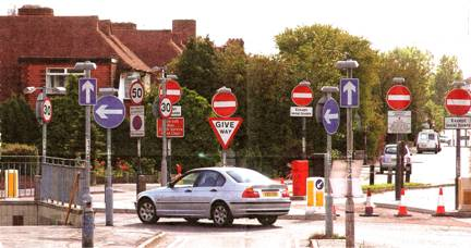
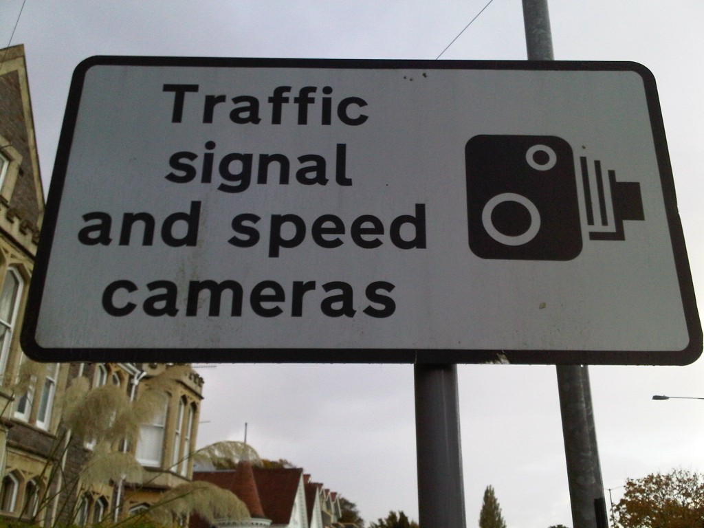
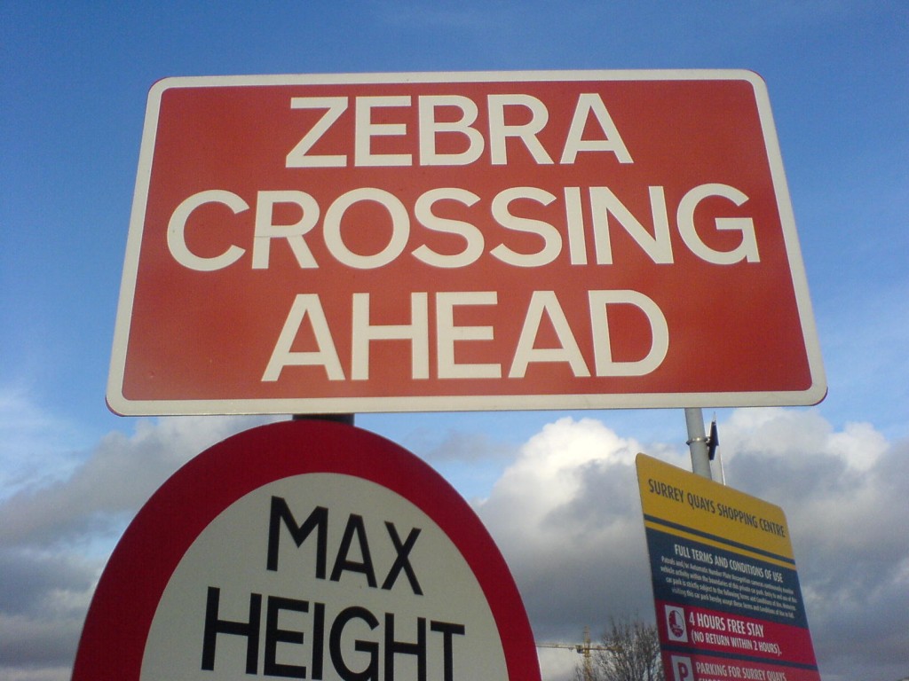
Generally, instructional signs are a sign of failure – failure to design roads in a way that stimulates sociable conduct. The following sign typifies the futile interventions that characterise traffic (mis)management. Try taking all that in as you drive past!
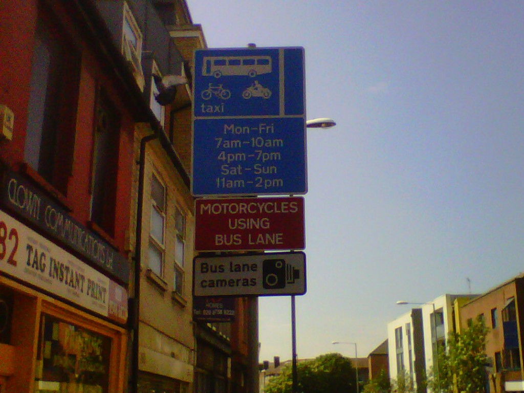
The road network is an obstacle course where we have to duck, dive and drive on defensive auto-pilot to survive the mean-spirited strictures imposed on us by faceless technocrats. On every journey we face a barrage of instructional signs which interfere with the job of watching the road and getting around safely and expeditiously – yet where are the directional road signs when we need them!?
Who is the overpaid moron who decided there was a need for an expensive road sign to warn us of a zebra crossing ahead? We’d see it in the road, pillock, if you weren’t bent on distracting us!
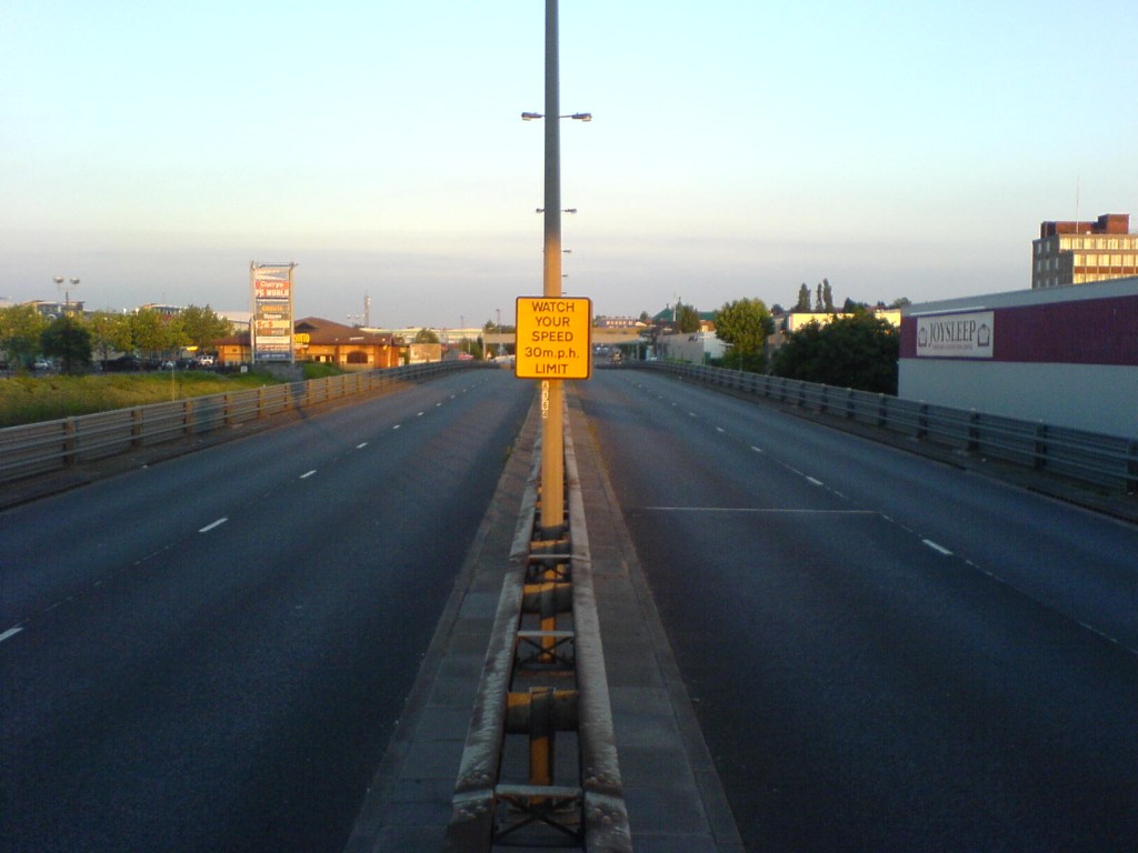
Yes, it’s a grade-separated dual carriageway. Here it is in close-up: 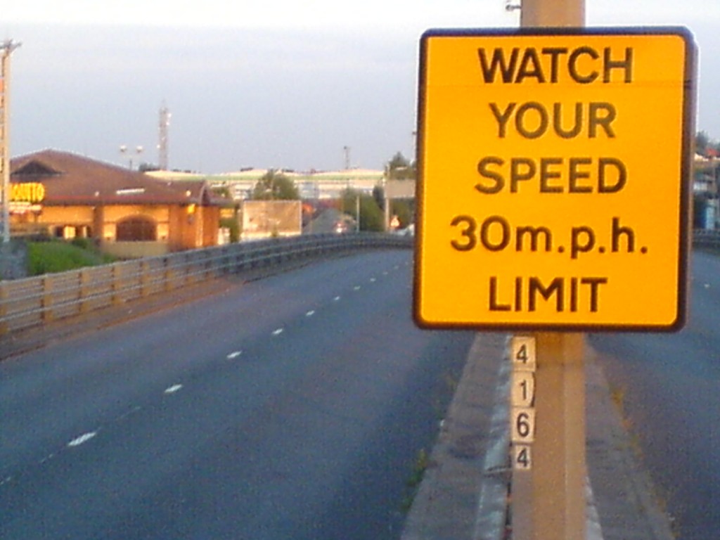
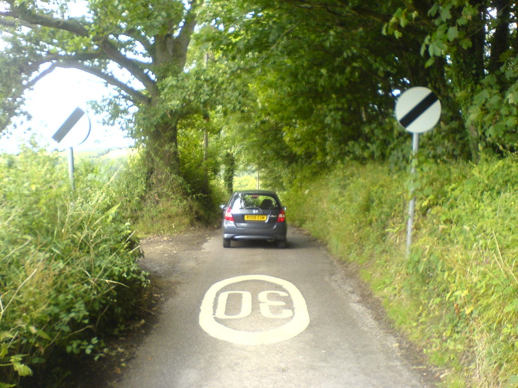
And yet on this road, no limit:
On the M4 once, we met a cloudburst. Everyone slowed to crawling speed. After a while, the rain eased off, and gradually we picked up speed. Five minutes later, we were doing a perfectly safe 60, when we passed a sign on a gantry that warned: SLOW DOWN. SPRAY! That’s how useful signs are to the needs of the moment.
This is a classic example of info overload and streetscape blight courtesy of local traffic engineers, approved by traffic managers, and sanctioned by national policy:
